onelife
How do you express personality on a website using micro interactions?
COMPANY

ROLE
UX Designer

Adding motion and refocusing site goals increase efficiency and use of employee benefits site.
Background
OneLife is a portal for employees all over the world to access company-provided health, financial and growth information. The previous site was difficult to update and contained a myriad of content that was irrelevant to the global audience. The company wished to cut costs by updating the site themselves rather than paying an outside vendor for upkeep of the existing site.
Celanese employees spread across three continents were the main userbase of this project. The new site needed to help employees quickly weed through an abundance of information in a more efficient manner.
Applying motion design to enhance the user experience.
Redesigned OneLife portal for global employees using motion design and improved navigation, enhancing efficiency and saving $100,000 in two years.
Research & Planning
The project began by hearing from Celanese employees across three continents, who struggled with an outdated, hard-to-navigate site filled with irrelevant content. The goal was to enable the company to manage the site internally, cutting costs associated with outside vendors. Understanding these requirements, we planned a new, more efficient site architecture to simplify navigation.
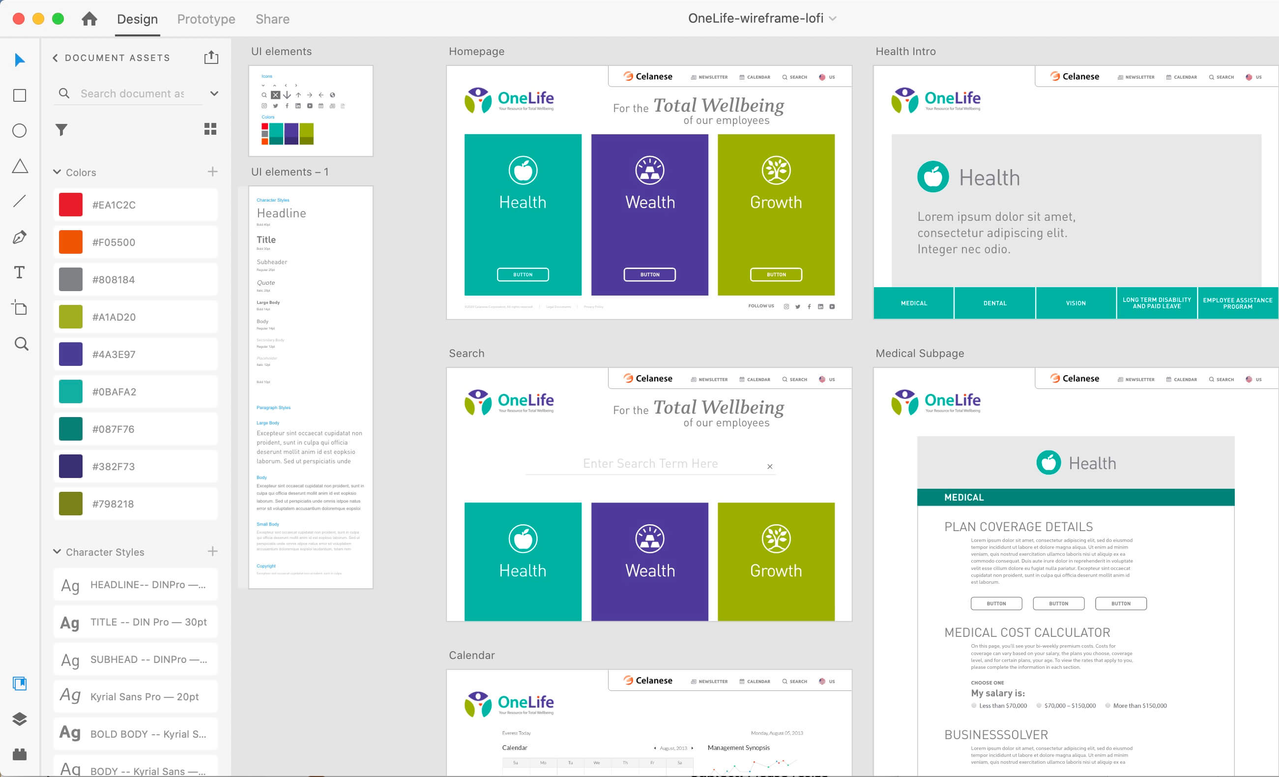
Design & Prototyping
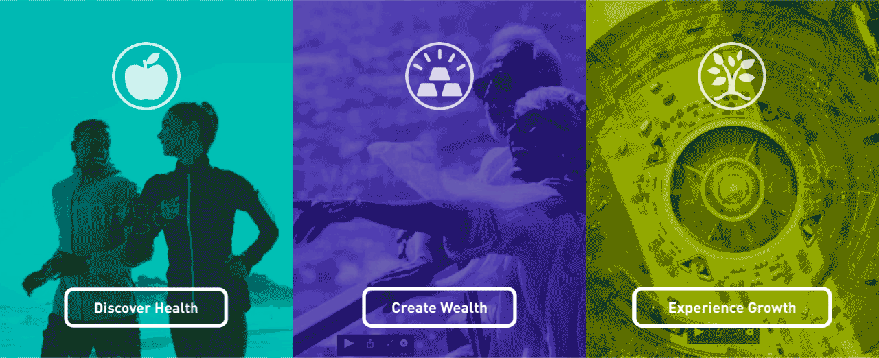
In the design phase, we used UI animations on the welcome screen to engage users and encourage exploration of the site’s sections, branded with icons and labels. Collaborating with a copywriter ensured the messaging and user experience were spot-on. A significant addition was the animated chatbot "Hi Chemi," designed in After Effects to assist users after periods of inactivity. These micro interactions were prototyped to enhance user engagement and site personality.
Development & Implementation
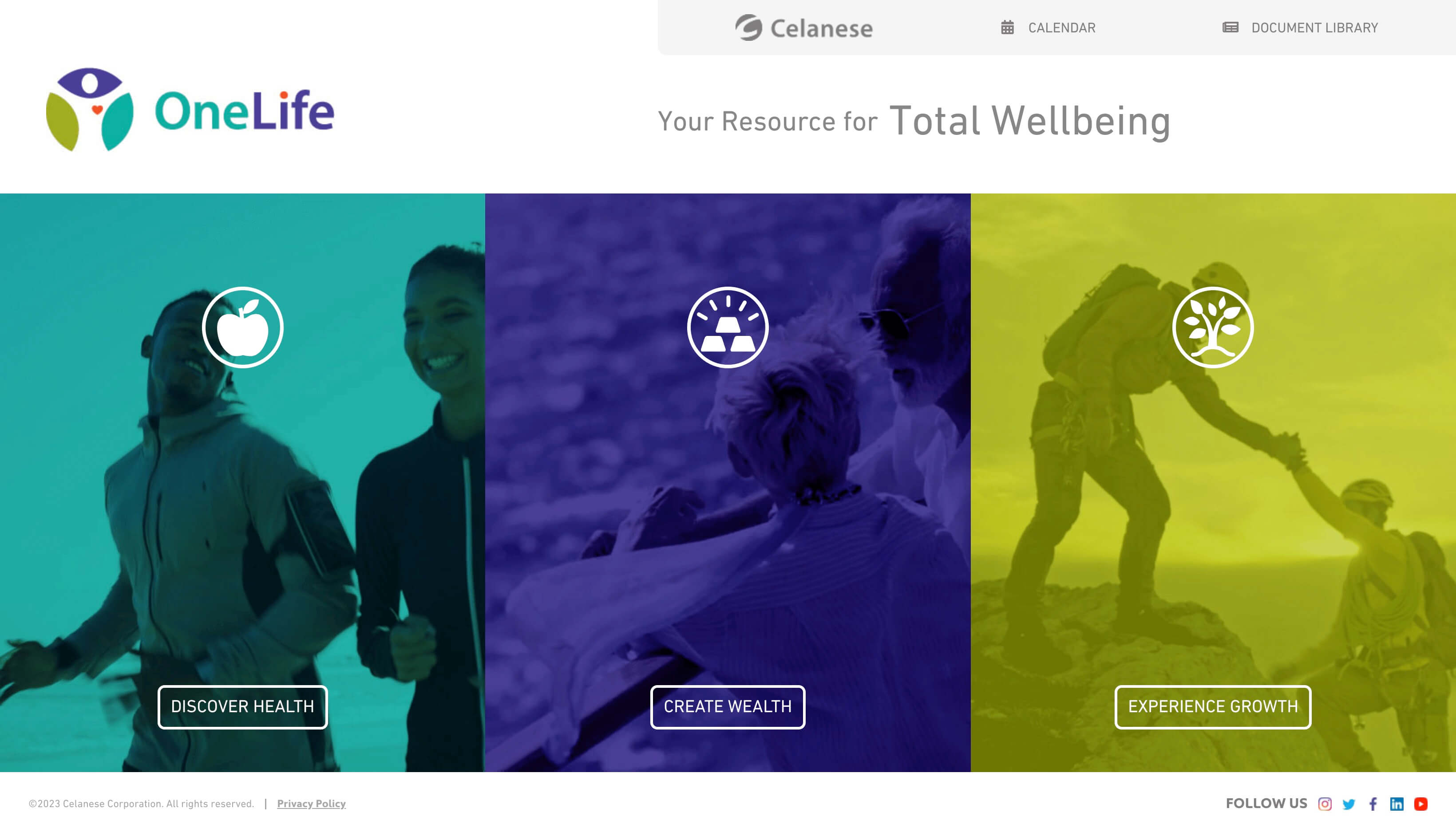
During development, I collaborated closely with developers to ensure a smooth transition from design to implementation. The simplified site architecture allowed users to find needed information within three taps. High fidelity wireframes were provided, incorporating distinct colors for Health, Wealth, and Growth sections, and quick links were added to streamline access to specific benefits and contact information. Regular check-ins and iterative feedback loops ensured the design elements were seamlessly integrated and functioned as intended.
Testing & Optimization
The final phase involved testing the new site to ensure it met user needs and functioned efficiently. The redesigned OneLife portal successfully allowed employees to navigate and find information quickly, enhancing overall user satisfaction. The project was completed in just two months, and by bringing the design in-house, the company saved $100,000 over two years. Continuous feedback and adjustments ensured the site maintained its effectiveness and user-friendliness.


Due to designing this in-house, the company saved $100,000 over the course of two years.
The UX research, site architecture, low and high fidelity wireframes, and UI animations were accomplished in just two months.