business conduct policy
How do you redesign a complex website for global audience with a streamlined, multilingual experience?
COMPANY

EXPERTISE
Product Design
UX
Prototype
ROLE
UX Designer
EXPERTISE
Product Design
ux
prototype

The Project
The Project
The Project
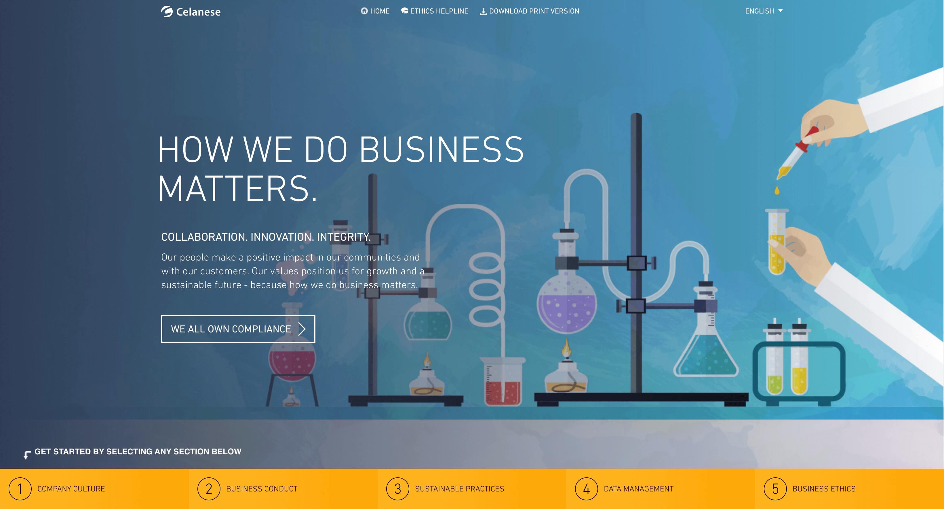
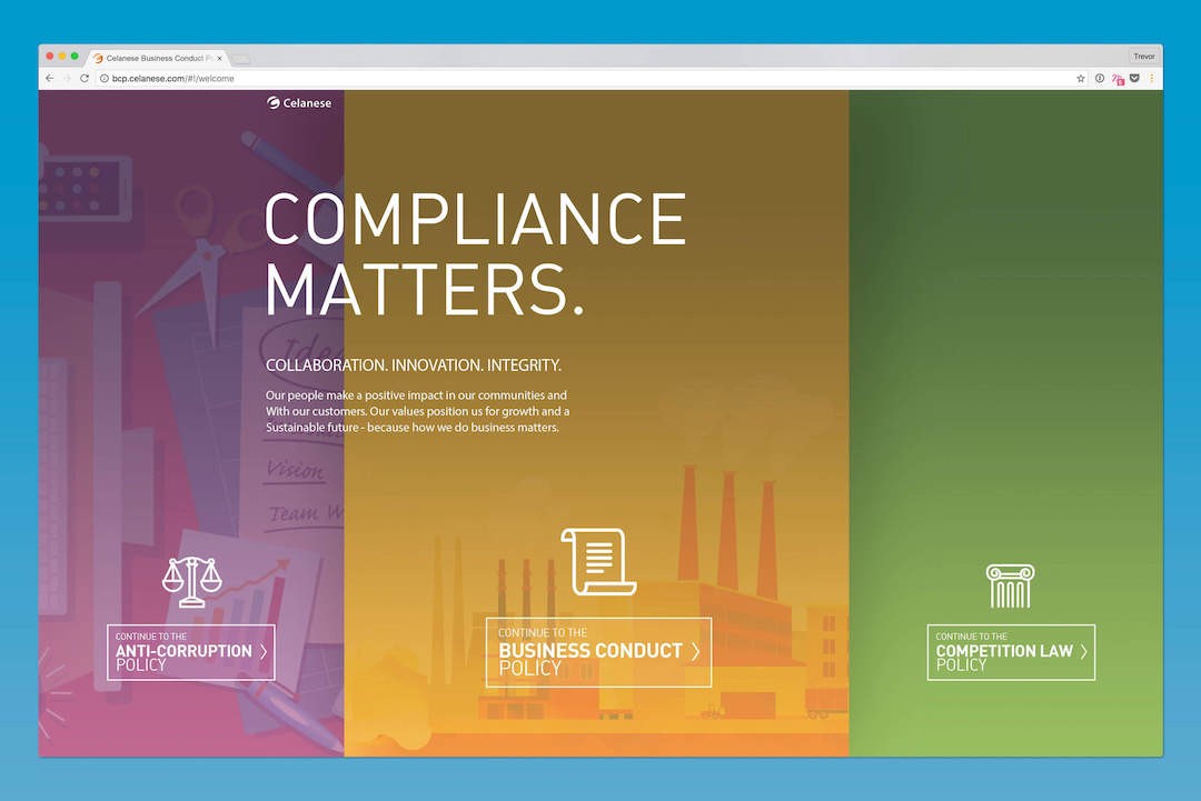
three clicks to get to the right content.
Background
The Legal department needed me to design an informational website that all employees would be required to understand. The wrinkle in this plan was that the experience should be localized in the employees’ own languages with the possibility of adding more languages through company acquisitions.
The Challenges
The Challenges
The Challenges
Challenge #1
Designing an experience that conveys complex information in the employees’ native languages.
Challenge #2
Simplifying the UI so the user can find the right information in three clicks or less.
The Process
The Process
The Process
Designed a multilingual legal information website with a simplified UI, sticky navigation, and cohesive design language across three interconnected sites for different employee levels.
Research & Planning
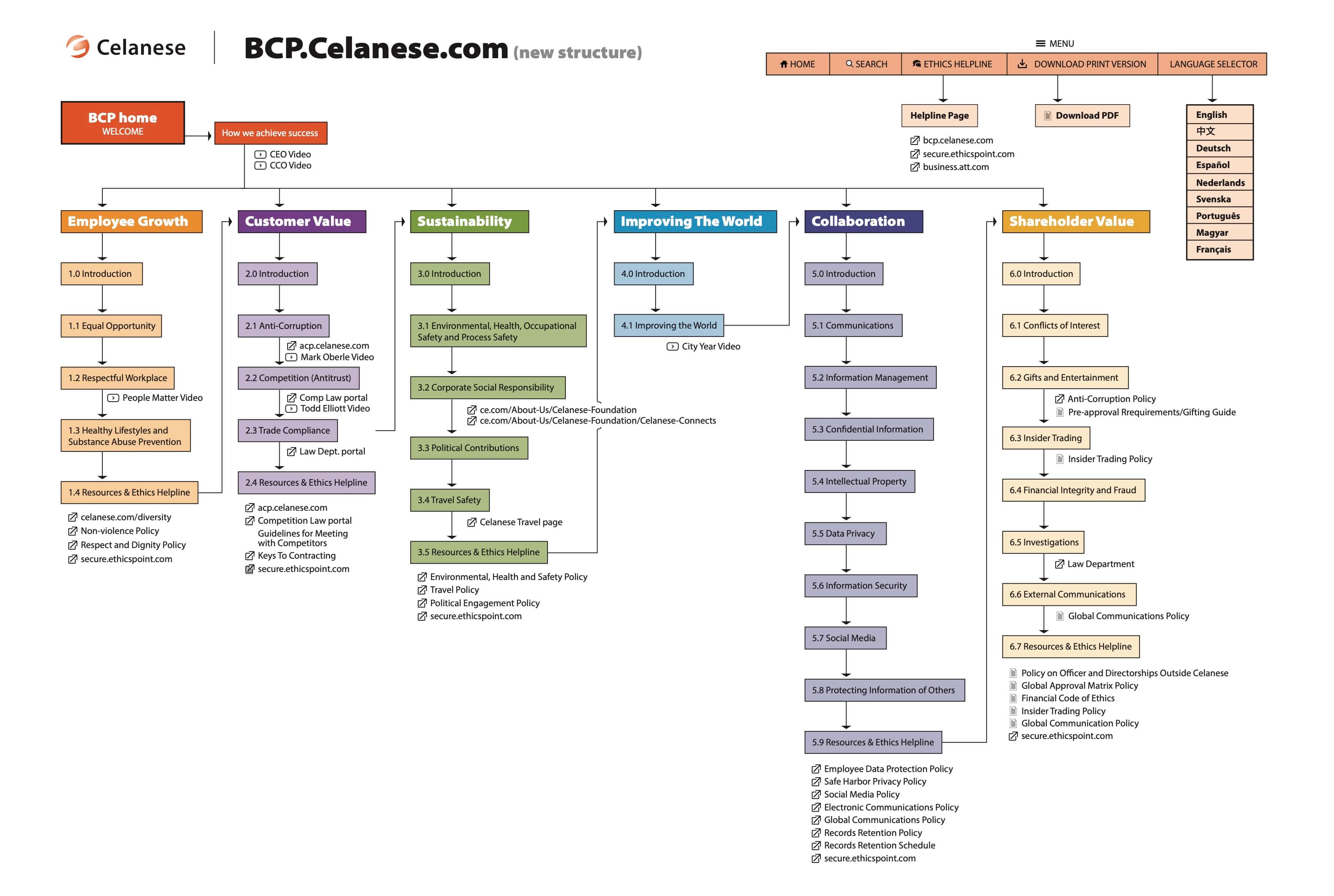
The project began with user interviews to understand the needs of employees and how to present complex legal information in their native languages. The main challenges were conveying complex information effectively with a simple user interface. After receiving a clear outline of desired sections, I mapped out their relationships and presented a linear sitemap to stakeholders for approval.
Design & Prototyping
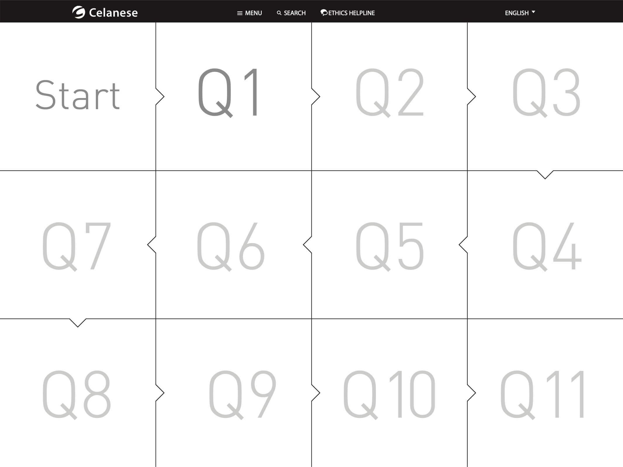
During the design phase, I focused on user-friendly features like sticky navigation with an open-close tray for quick access. I also created an animated breadcrumb prototype to show user location and page sequence. Unfortunately, it wasn’t implemented due to technical issues with the backend. An initial prototype proved unsuitable, leading to a pivot after stakeholder interviews. This iteration ensured the final design addressed the users' needs effectively.
Development & Implementation
In development, I refined the design and created two sister sites alongside the Business Conduct Policy website, tailored to different employee levels. A shared visual language with distinct primary colors connected the sites while maintaining unique identities. This collaboration with the developers facilitated a consistent UI, enhancing user experience and navigation.
Testing & Optimization
The final phase involved rigorous testing to ensure the design met project goals. Despite initial setbacks, the final solution provided a quick, easy reference for users. The consistent UI across all three websites reinforced their interconnected nature and streamlined navigation. Feedback from testing informed necessary adjustments, ensuring effective communication of legal information to all employees.
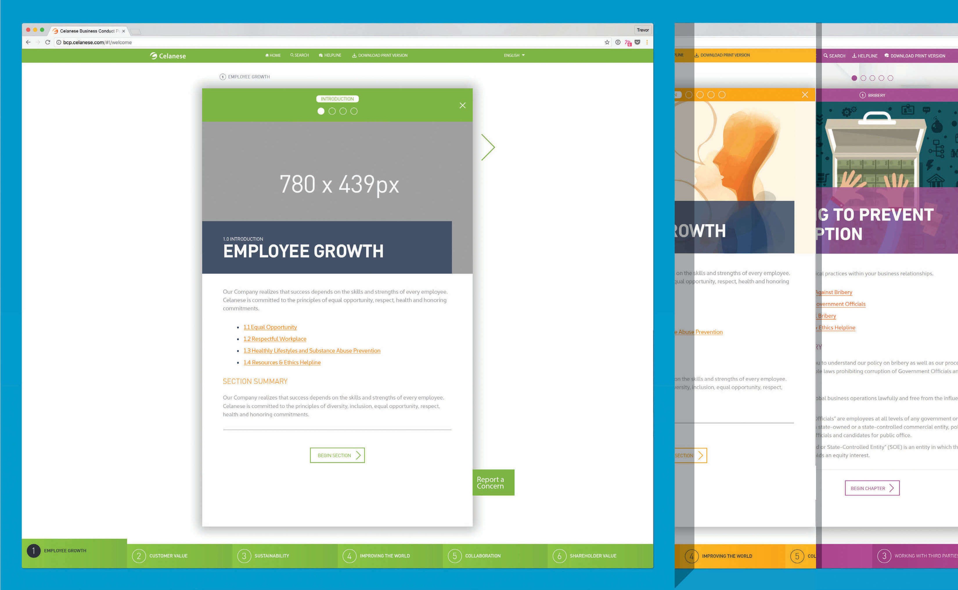
site architecture
The Legal department already knew the sections of information they wanted to display. My first step was to figure out the relationship between sections and pages. I settled on a linear approach from page to page and section to section. I presented this sitemap to the stakeholders to get approval before diving into the design phase.
sticky navigation
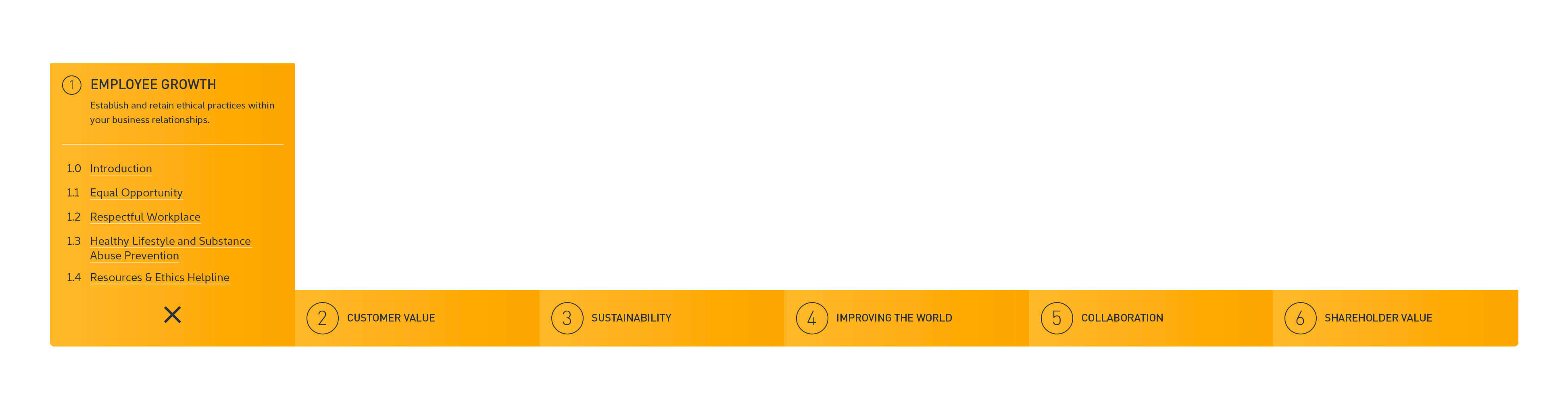
Because this functions as a quick reference website, I designed a sticky navigation with a tray that opens and closes so the user can find what they need quickly.
animated breadcrumb
I created this prototype in Principle as a way to show the user where they are and a quick way to show what’s before and after. This animation was ultimately not implemented as there were some unforeseen technical complications with the backend.

failed prototype
This was an instance where I got ahead of myself. I dove into wire framing and prototyping before fully understanding the context of the problem. While I’m still quite satisfied with the concept, I now know this solution would not have worked for the users of a quick reference site. I realized this as I interviewed the stakeholders along the way and quickly pivoted to the final solution that did solve the challenge.
legal trilogy
Along with the Business Conduct Policy website, I designed two sister sites that targeted employees depending on their job level and responsibilities. This single page site gave the user a direct path to each subsequent site.
sticky navigation
Because this functions as a quick reference website, I designed a sticky navigation with a tray that opens and closes so the user can find what they need quickly.
site architecture
The Legal department already knew the sections of information they wanted to display. My first step was to figure out the relationship between sections and pages. I settled on a linear approach from page to page and section to section. I presented this sitemap to the stakeholders to get approval before diving into the design phase.
sticky navigation
Because this functions as a quick reference website, I designed a sticky navigation with a tray that opens and closes so the user can find what they need quickly.
animated breadcrumb
I created this prototype in Principle as a way to show the user where they are and a quick way to show what’s before and after. This animation was ultimately not implemented as there were some unforeseen technical complications with the backend.
failed prototype
This was an instance where I got ahead of myself. I dove into wire framing and prototyping before fully understanding the context of the problem. While I’m still quite satisfied with the concept, I now know this solution would not have worked for the users of a quick reference site. I realized this as I interviewed the stakeholders along the way and quickly pivoted to the final solution that did solve the challenge.
legal trilogy
Along with the Business Conduct Policy website, I designed two sister sites that targeted employees depending on their job level and responsibilities. This single page site gave the user a direct path to each subsequent site.
extending the design language
I designed the three websites to share a common visual language, though each one was distinguished by a different primary color. The benefit of the consistent UI helped to establish the connection between the websites.
The Results 🎯
The Results 🎯
The Results 🎯
An easy-to-use reference site with a maximum of three clicks to get to an answer.
Supporting Campaign Materials
Supporting Campaign Materials
Supporting Campaign Materials
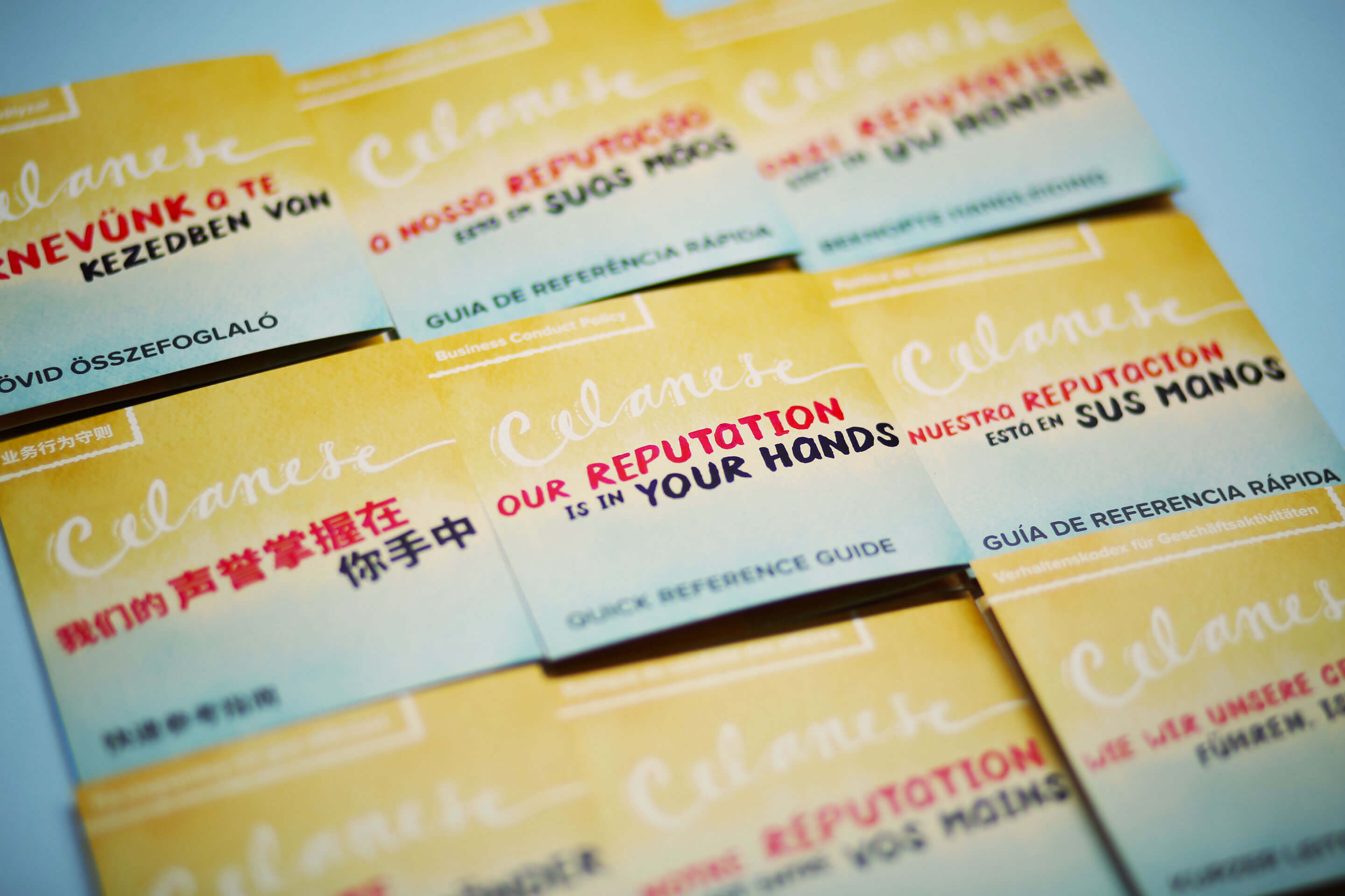
translating the design
I led a card sorting focus group to take the 20-something ideas that Legal wanted to address and narrow down to 7 overall concepts. I designed these accordion folded handouts in a size that can fit in a pocket. I troubleshooted issues with getting the text characters to display correctly for some of the East Asian languages. After researching the issues, I fixed the problem and these handouts printed correctly.
Follow me on LinkedIn
Selected case studies
© 2024 – Trevor Goodman
Follow me on LinkedIn
Selected case
studies
© 2024 – Trevor Goodman
Follow me on LinkedIn
Selected case studies
© 2024 – Trevor Goodman