How do you create a custom icon set that is unique and consistent?
COMPANY

EXPERTISE
iconography
UX
UI
ROLE
UX Designer
EXPERTISE
Iconography
UX
UI

The Project
The Project
The Project
Designing timeless, clear icons assists in communicating cyber safety education.
Background
The previous batch of icons, while fun, were inconsistent: different line weights, colors, shapes, and textures. It was difficult to discern the meanings of the icons.
The new icons needed to be comprehensible, with or without a label, to a global audience. Along with the updated iconography, I designed a new filtering feature to allow the user to view topics within three categories on the website: Vigilance, Security, and Education.
The Challenge
The Challenge
The Challenge
Design custom icons representing highly specialized subjects for a wide range of technical users.
The Process
The Process
The Process
Redesigned website with improved icon consistency and recognition, using cohesive shapes and color-coded categories for Vigilance, Security, and Education, enhancing user navigation and experience.
Research & Planning
The project began with a thorough analysis of the existing campaign, which had been running for a year. The original icons used in this campaign were examined and found to be ineffective due to their lack of cohesion. This analysis highlighted the need for a more unified approach to improve the recognizability and effectiveness of the icons.
Design & Prototyping
The primary focus in this part of the project was on redesigning the icons to create a consistent visual identity. I made the decision was made to use a consistent holding shape for all icons, which would instantly help with recognizability. To maintain simplicity and memorability, text was removed from the icons. Additionally, a color scheme was developed to correspond with the three categories of Vigilance, Security, and Education. This color-coding would help users visually differentiate and navigate through the website's content.
Development & Implementation
The redesigned icons and the new color-coded categories were integrated into the website. The website structure was carefully designed to incorporate these elements, allowing the categories to function as filters for viewing relevant topics. This new structure aimed to enhance user experience by making it easier for users to find and engage with content related to the three categories.
Testing & Optimization
The final phase focused on testing and optimizing the new design to ensure it met the project's goals. User navigation was tested to confirm that the new filters and iconography improved the overall usability of the website. Feedback from these tests was used to make any necessary adjustments, ensuring that the redesigned website provided a cohesive, user-friendly experience.
how it started
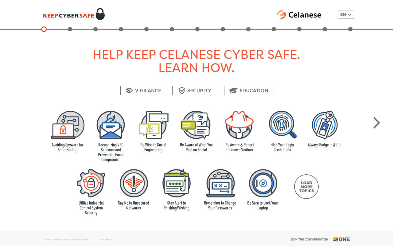
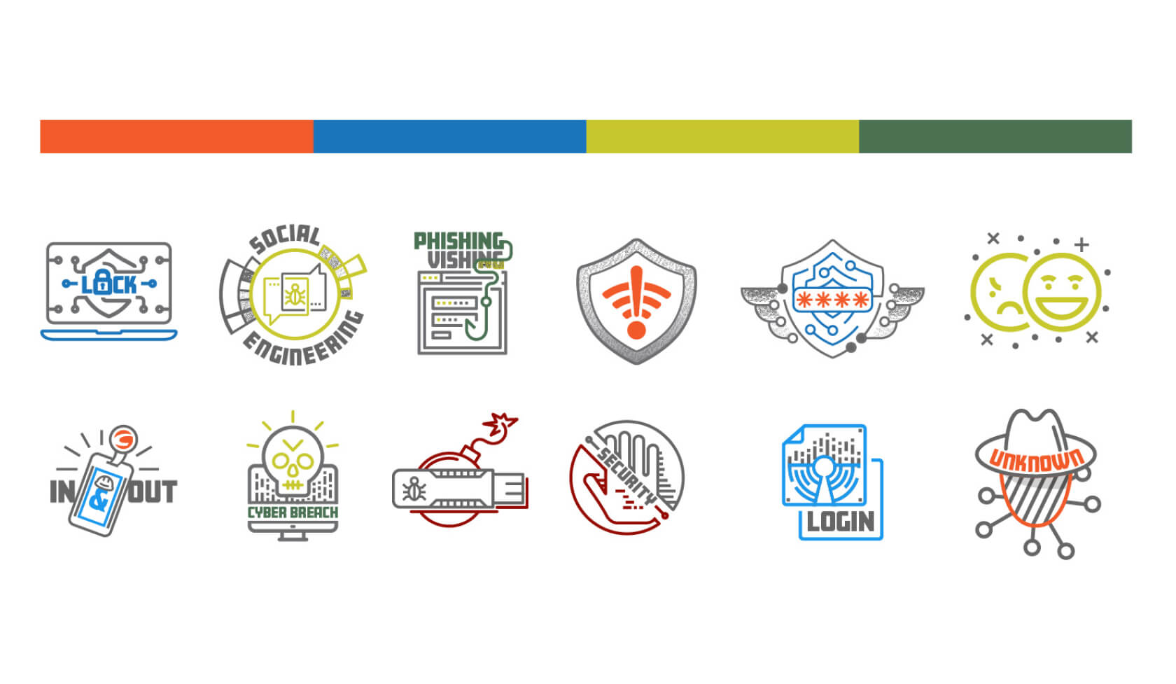
(“The Originals”)This website corresponds with a year long campaign. Each original icon was the focus for a month. These previous icons weren’t a cohesive group, so they were ineffective.
how it’s going (“The redesigned”)
First I decided to use a consistent holding shape that would instantly help with recognizability. I did not use text in the icons to keep them simple and memorable.
The colors correspond with the three categories of Vigilance, Security, and Education. I designed the website so that these categories function as a filter to view those topics.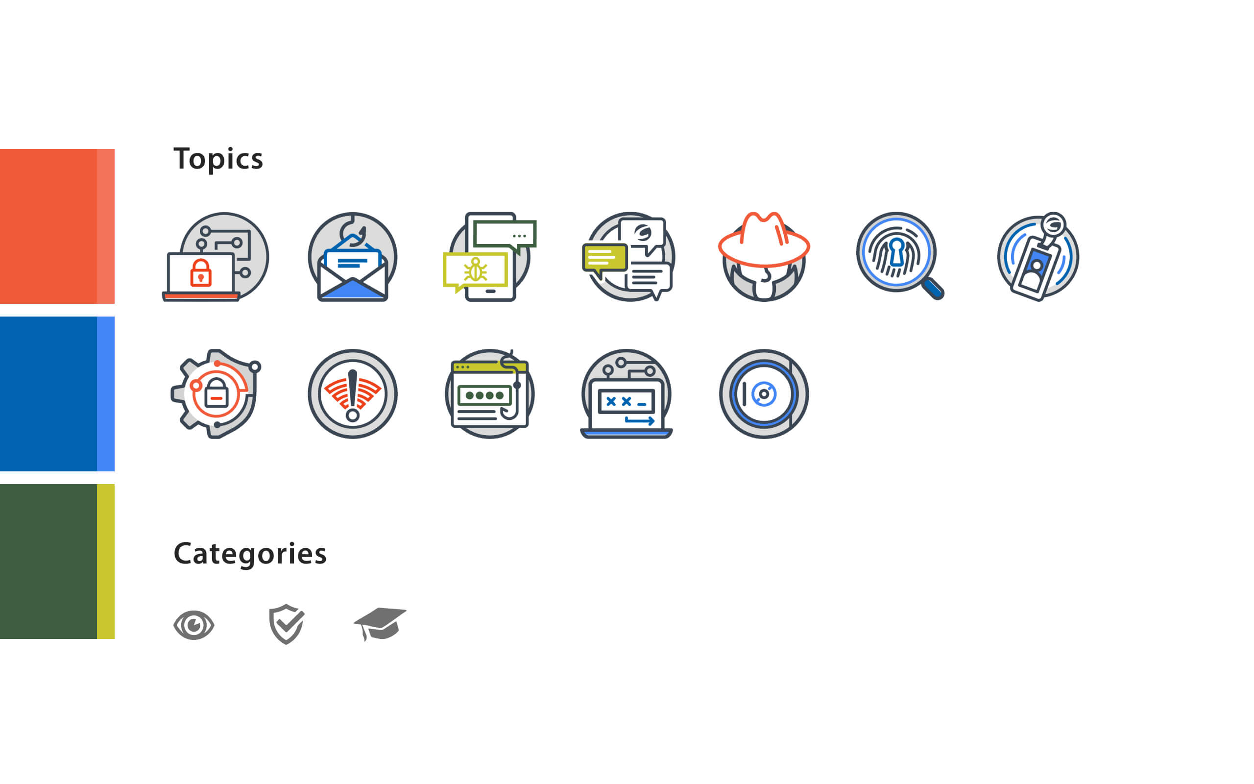
how it started
(“The Originals”)This website corresponds with a year long campaign. Each original icon was the focus for a month. These previous icons weren’t a cohesive group, so they were ineffective.
how it’s going (“The redesigned”)
First I decided to use a consistent holding shape that would instantly help with recognizability. I did not use text in the icons to keep them simple and memorable.
The colors correspond with the three categories of Vigilance, Security, and Education. I designed the website so that these categories function as a filter to view those topics.how it started
(“The Originals”)This website corresponds with a year long campaign. Each original icon was the focus for a month. These previous icons weren’t a cohesive group, so they were ineffective.
how it’s going (“The redesigned”)
First I decided to use a consistent holding shape that would instantly help with recognizability. I did not use text in the icons to keep them simple and memorable.
The colors correspond with the three categories of Vigilance, Security, and Education. I designed the website so that these categories function as a filter to view those topics.
how it started (“The Originals”)
This website corresponds with a year long campaign. Each original icon was the focus for a month. These previous icons weren’t a cohesive group, so they were ineffective.
how it’s going (“The redesigned”)
First I decided to use a consistent holding shape that would instantly help with recognizability. I did not use text in the icons to keep them simple and memorable.
The colors correspond with the three categories of Vigilance, Security, and Education. I designed the website so that these categories function as a filter to view those topics.how it started (“The Originals”)
This website corresponds with a year long campaign. Each original icon was the focus for a month. These previous icons weren’t a cohesive group, so they were ineffective.
how it’s going (“The redesigned”)
First I decided to use a consistent holding shape that would instantly help with recognizability. I did not use text in the icons to keep them simple and memorable.
The colors correspond with the three categories of Vigilance, Security, and Education. I designed the website so that these categories function as a filter to view those topics.
The Results 🎯
The Results 🎯
The Results 🎯
A series of recognizable icons that can be used anywhere for years to come.
Supporting Campaign Materials
Supporting Campaign Materials
Supporting Campaign Materials
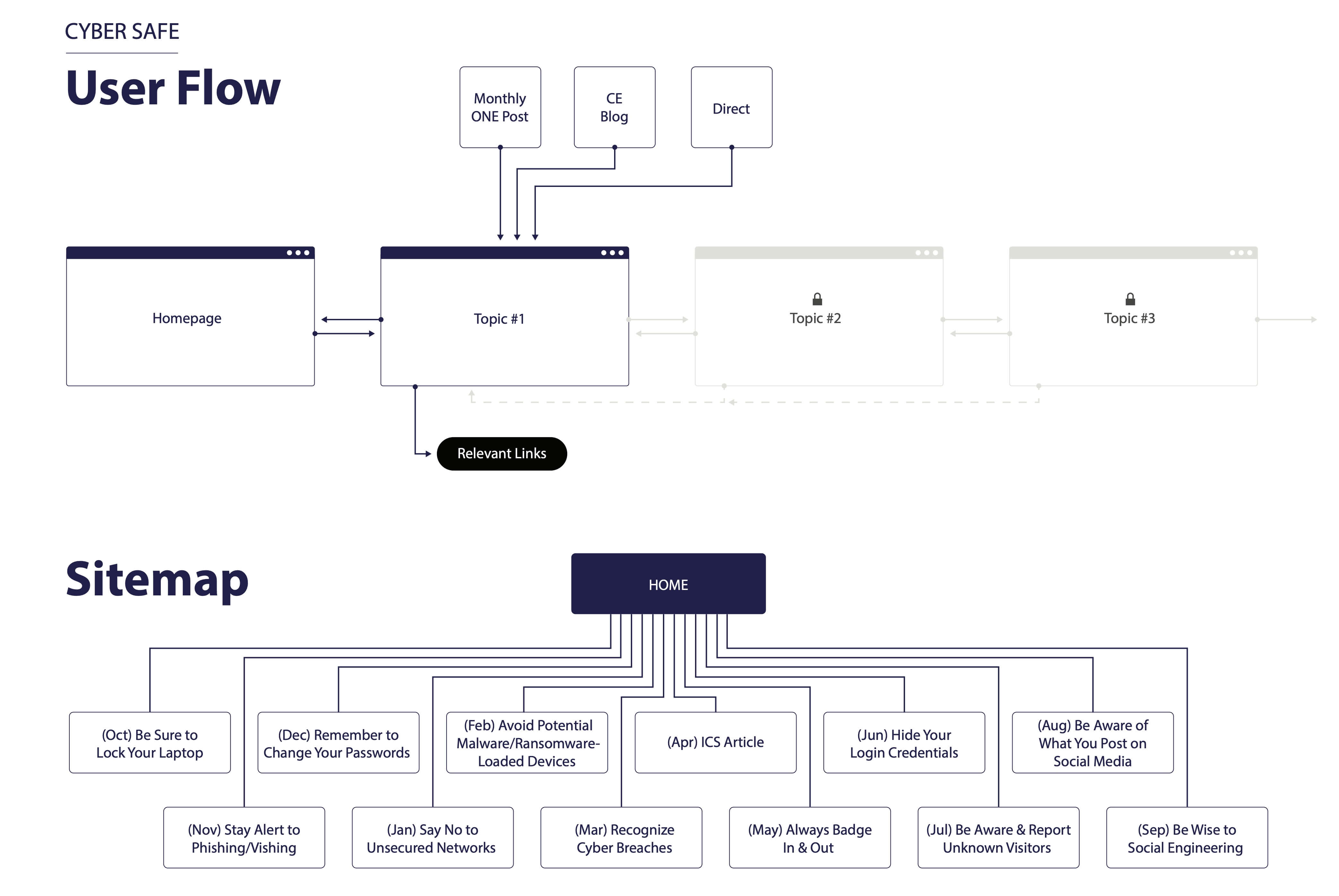
user flow
This Cyber Secure campaign website was designed around a monthly release schedule for each topic with scenarios and helpful links. This shows the user journey from the sources of marketing to employees. Users came from company intranet posts, the company blog, and from the email campaign.
low fidelity wireframing
This early proof of concept shows how the main menu and navigation function. Though the site is responsive, most user traffic came from desktops due to the user needing a vpn to access. Very few employees have company issued phones.
After reviewing this wireframe with the internal client, I made the decision to focus more on the individual icons and not the broader categories.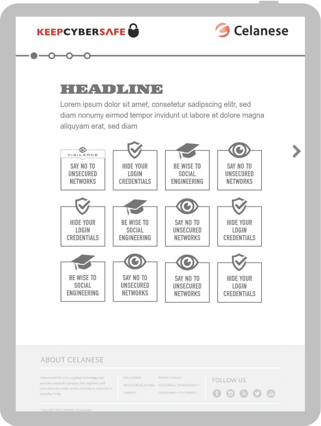
logo lock up
I wanted to add a sense of delight and discoverability to the website with this logo animation. The logo links to the homepage and is static until the user interacts with the button. I created this animation in Adobe After Effects.
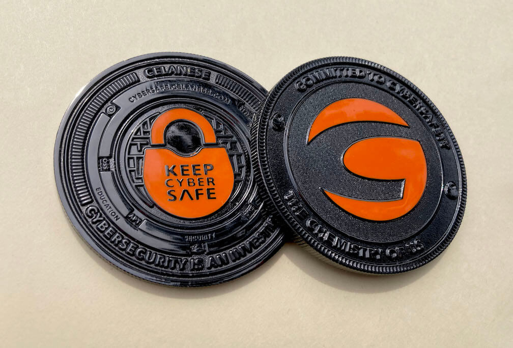
ka-ching
One of the most satisfying parts of this campaign was designing a 2.5” diameter, physical, metal coin using icons from the website. I designed the coin with the idea of discoverability. I hid cyber security acronyms within the design. I used different textures, polishes, and color in this design.
user flow
This Cyber Secure campaign website was designed around a monthly release schedule for each topic with scenarios and helpful links. This shows the user journey from the sources of marketing to employees. Users came from company intranet posts, the company blog, and from the email campaign.
low fidelity wireframing
This early proof of concept shows how the main menu and navigation function. Though the site is responsive, most user traffic came from desktops due to the user needing a vpn to access. Very few employees have company issued phones.
After reviewing this wireframe with the internal client, I made the decision to focus more on the individual icons and not the broader categories.logo lock up
I wanted to add a sense of delight and discoverability to the website with this logo animation. The logo links to the homepage and is static until the user interacts with the button. I created this animation in Adobe After Effects.
ka-ching
One of the most satisfying parts of this campaign was designing a 2.5” diameter, physical, metal coin using icons from the website. I designed the coin with the idea of discoverability. I hid cyber security acronyms within the design. I used different textures, polishes, and color in this design.
Follow me on LinkedIn
Selected case studies
© 2024 – Trevor Goodman
Follow me on LinkedIn
Selected case studies
© 2024 – Trevor Goodman
Follow me on LinkedIn
Selected case
studies
© 2024 – Trevor Goodman